Tuesday, 24 June 2014

A comparison between the use of design to support narrative in Josie Rourke’s production of ‘Coriolanus’ and Lucy Mckenzie’s ‘Quodlibet’ series

Set in the midst of war and famine in ancient Rome, the play begins in the streets of ancient Rome where plebeians fought for more grain and a democratic society. In response to the riots, the wealthy patricians decide to appoint tribunes to represent the lower classes, including war hero Caius Martius, who is granted the name ‘Coriolanus’ in recognition of his great deeds in the siege of Corioli and defeating the enemy Volscians. However, in order to become consul, Coriolanus must plead for the votes of the plebeians. Overcome by his pride and arrogance, Coriolanus fails to play the role of the diplomat and is rejected by the plebeians after some persuasion from two clever and manipulative tribunes, Brutus and Sicinius, or Sicinia, as Rourke’s Sicinius is female. Driven to fury, Coriolanus speaks ill of the very idea of democracy and is declared a traitor to the Roman state and exiled.

Visual semiotics is essential to the success and coherence of any performance, achieved mainly by effective set design and costumes, which support and enhance the narrative, and Josie Rourke’s production of Coriolanus at the Donmar Warehouse is no different. These components are crucial in the audience’s understanding of the themes, mood and context of the performance, both geographical and historical, the latter of which is made slightly ambiguous in Rourke’s production as she chooses to emphasise the tragedy of Coriolanus, the fallen soldier, and the political issues explored in the play. Set designer Lucy Osbourne uses the intimate space of the Donmar Warehouse with great ingenuity to support the ideas and narrative that Rourke focuses on.

Osbourne creates a set that is stark and bare, with only a high brick wall, a ladder and twelve chairs. The minimalist approach to the set allows the audience to focus solely on the emotions of the characters and their story. Removing the barriers that historical context may create, the audience is better able to sympathise with the characters and see them as human beings, even applying the themes of the play to their own lives, rather than viewing them as relics from a long forgotten past thus creating a sense of detachment.
The company of Coriolanus, main stage. Donmar Warehouse 2013.


In addition to the props on stage, an unusual, diamond shape is seen on the stage floor, which young Coriolanus paints over in blood red paint, marking the area where most of the action takes place. Perhaps this is a subtle technique used by Osbourne which serves as a foreboding of the blood shed that is to come. It can be argued that the arrangement of the row of chairs present on stage throughout the play could be likened to chairs in parliament, as the consul plays a similar role. The political narrative of Rome as a nation suffering from war and striving towards a new, democratic state is further reflected in the design of the chairs; uniform, bare and unadorned, as well as matching the production’s overall aesthetic.

Similar to Osbourne, Lucy McKenzie, a young Scottish artist, uses interiors and objects as a way of exploring narratives. Inspired by Greil Marcus’s book ‘In the Fascist Bathroom’ on post punk, McKenzie decided to quite literally explore what the interior design of a space may look like in accordance to particular political and ideological inclinations. In her paintings called ‘Quodlibet’ XII, XXII and XX, subtitled Objectivism, Nazism, Fascism, respectively, McKenzie depicts a cork pinboard which functions as a collage on which she assembles copies of paint samples, various kinds of marble and architectural drawings. In each of the three paintings, the artist creates slightly different variations of one aesthetic style in accordance to a particular ideological narrative.

In ‘Nazism’, the colour palette on both the marble and paint samples is similar to that which is associated with neoclassical architecture, most popular amongst the members of the third Reich and Hitler himself. The plans for both the interiors and the architecture showed an emphasis on minimal decorations and an emphasis on straight lines which was typical of neoclassicism. Finally, the book cover titled “Das Behagliche Heim,” which describes “how one recognizes a National Socialist by his home”, neatly ties together a representation of Nazism through design.

Lucy Mckenzie’s Quodlibet ‘Nazism’ and ‘Objectivism’

Equally, in ‘Objectivism’, McKenzie not only provides the viewers with modernist architectural drawings but also presents us with disparate symbols. For example, the painting depicts the cover of an Ayn Rand book, the founder of the objectivist philosophy, and a photograph of Tarama de Lempicka along with some of her works, which can be found on the covers of several editions of Rand’s novels. The colours; deep reds, greens and greys, are characteristic of the modernist colour palette and can be seen in the marble samples as well as Lempicka’s paintings. By compiling these subjects in her painting McKenzie creates a narrative through design that is recognisable and understandable to the audience.

Osbourne uses colours as symbols of power and to support the development of characters. For example, the costumes and leather accessories, in warm, muted tones of greys, reds and browns, compliment the dismal and almost apocalyptic mood of the play as well as exuding a sense of unstated power. Some characters, such as Aufidius, and even Brutus and Sicinia, are often seen wearing dark blues and purples which are colours associated with power or high class in ancient Rome. Whereas these colours are fitting for Aufidius, general of the Volscian army, it is interesting that Brutus and Sicinia, despite being plebeians, are seen wearing such colours. Perhaps Osbourne uses this as a subtle hint to show that both have reached a higher state due to their influence and manipulation of the masses in the condemnation of Coriolanus.


Coriolanus (top), Aufidius (middle), Brutus (bottom)
Furthermore, the imagery surrounding Coriolanus’ costume shows his decline in Roman society and supports the possible interpretation of his character as a martyr, a tragic hero. Seen in earlier as a noble, Roman general, ready for battle with in his red, leather armour, Coriolanus’ costume changes as the play progresses -his crown looks as though it is made of thorns and his senator’s garments resemble the robes of Christ.  

Coriolanus and Aufidius. Donmar Warehouse. 2013

 The red and black brick wall that serves as the backdrop is changed throughout the play to convey different emotions, moods and to support the action on stage. For example, in the beginning of the play, the wall is seen covered in graffiti as the angry Romans express their outrage about the food shortages that seem not to affect the wealthy aristocrats. This successfully conveyed the unrest amongst the citizens, with the graffiti becoming a symbol of their rebellion.

However, during the siege of Corioli, video designer Andrzej Goulding transforms the bricked wall- an explosion of flashing fireworks is projected on it; with falling rubble, dark lighting and sound designer Emma Laxton’s loud, electronic music, an atmosphere of chaos is created which appropriate for the war going on somewhere beyond the stage, or perhaps above it, as suggested by Ismene Brown from The Art Desk.  Brown comments: ‘The war is heard, not seen within the high black and blood-red brick walls, somewhere up above a high ladder into, perhaps, street level from this bunker’(Brown 2013). This poses an interesting question as to whether Rourke and Osbourne were commenting on the tendency of politics and manipulation, as it is the consul who decides the fate of Coriolanus from hero, to enemy and exiled, to take place ‘behind the scenes’, a safe distance away from the violence and death their decisions may cause.

Coriolanus. Donmar Warehouse 2013
The stage is transformed once again in what was arguably the most compelling, intimate and revealing scene, not originally in the play, in which an exhausted Coriolanus stands alone, centre stage, washing away the blood from his battle wounds. Lighting designer Mark Henderson darkens the entire stage, save for the inescapable, ferocious white light that shines upon him as water surges down on from high above, turning red as it mixes inextricably with the blood from his injuries. David Benedict of Variety describes it as ‘a magnificent image in its own right’, as the water is ‘spraying into the dark like sparks off steel’ (Benedict 2013). By removing all other aspects of the set from view, Henderson emphasises Coriolanus’ isolation, showing a physical and emotional vulnerability to an otherwise strong, arrogant and unyielding protagonist, thus imposing the idea of him as a tragic hero.

It is only with the aid of set, costume, sound and lighting design that such powerful images can be conjured on stage, convey to the audience ideas and emotions that words don’t always succeed in doing so. Design helps to build a visual language that transcends words, not only supporting the action on stage but creating a narrative of its own, creating tension in a visual form and becoming a living character in itself.


Bibliography
Benedict, D. 2013. London Theatre Review: ‘Coriolanus’ Starring Tom Hiddleston. [online] 17th December. Available at: http://variety.com/2013/legit/reviews/london-theater-review-coriolanus-starring-tom-hiddleston-1200969320/ [Accessed: 31 Dec 2013].
Bilgehan Özpek, B. 2006. Ayn Rand, Objectivism and Architecture. MA. The Graduate School of Social Sciences of Middle East Technical University.
Billingdon, M. 2013. Coriolanus Review. The Guardian, 18th December.
Bracewell, M. 2011. Adventures Close to Home. Mousse Magazine, Iss. 29.
Brecknell, L. 2013. Review: Coriolanus. [online] Available at: http://theyorker.co.uk/arts/performing-arts/off-campus/14543-review-coriolanus/ [Accessed: 26 Dec 2013].
Brown, I. 2013. Coriolanus, Donmar Warehouse | Theatre reviews, news & interviews | The Arts Desk. [online] Available at: http://www.theartsdesk.com/theatre/coriolanus-donmar-warehouse/ [Accessed: 27 Dec 2013].
Colquhoun, A. 2002. Modern architecture. Oxford: Oxford University Press.
Coriolanus, Donmar Warehouse, review. 2013. [online] 18th December. Available at: http://www.telegraph.co.uk/culture/theatre/theatre-reviews/10524062/Coriolanus-Donmar-Warehouse-review.html [Accessed: 24 Dec 2013].
Donmarwarehouse.com. 2013. Coriolanus - Donmar Warehouse. [online] Available at: http://www.donmarwarehouse.com/whats-on/donmar-warehouse/2013/coriolanus/ [Accessed: 20 Dec 2013].
Feisner, E. A. 2000. Colour. London: Laurence King.
Kueber, P. 2008. 1950s and 60s paint colors -- from Sears' classic Harmony House collection - Retro Renovation. [online] Available at: http://retrorenovation.com/2008/01/02/1950s-and-60s-paint-colors-from-sears-classic-harmony-house-collection/ [Accessed: 11 Jan 2014].
Leaver-Yap, I. 2013. Afterall • Journal • Lucy McKenzie: Manners. [online] Available at: http://www.afterall.org/journal/issue.34/lucy-mckenzie-manners [Accessed: 28 Dec 2013].
Leavitt, D. 2009. Mid Century Modern Colours. [online] Available at: http://www.modative.com/modern-architects-blog/bid/17263/Mid-Century-Modern-Colors [Accessed: 11 Jan 2014].
Llewellyn-Jones, L. 2001. The Use of Set and Costume Design in Modern Production of Ancient Greek Dramas. The Open University.
Rosenfeld, G. D. 2000. Munich and memory. Berkeley: University of California Press.
Sitemaker.umich.edu. 2014. Art Under Fascism: Architecture. [online] Available at: http://sitemaker.umich.edu/artunderfascism/architecture [Accessed: 29 Dec 2013].
Squidoo. 2014. Traditional Neoclassical Interior Design and Home Decor. [online] Available at: http://---chazz.squidoo.com/neoclassical-interior-design-and-home-decor [Accessed: 29 Dec 2013].

Vesters, C. 2012. Lucy McKenzie’s “50 Shades” | Art Agenda. [online] Available at: http://art-agenda.com/reviews/lucy-mckenzie%E2%80%99s-50-shades/ [Accessed: 24 Dec 2013].

Statement of Intent for Final Major Project


In the past year, I have learnt much about my abilities, interests and have pushed myself to discover new processes and ideas. Not only have I gained practical skills, such as using the metal workshop and model making, but I have also learned to think about art and design more critically and conceptually, allowing the outcome of my projects to be more resolved.

At first I struggled to choose between the fine art and 3D design pathways as I had an interest in both. Whereas fine art was where I initially felt more comfortable – as a discipline in which I could freely explore conceptual and abstract ideas – I found theatre design to be a good way of reconciling my concern for literature and the visual arts, in some ways more challenging, as abstract and conceptual ideas have to be developed within stricter parameters. Ultimately, I chose to focus on set design as it would help nurture my new found interest in theatre, film, design and making, suiting my increasingly narratively based work, and teaching me to express ideas in ways that I had not done before.

For this project I am concerned with an exploration of Paris as a major centre of literary and artistic innovation in the early 20th century. Becoming a beacon for a modernist, bohemian lifestyle, it nurtured and housed emerging artists and writers of ‘The Lost Generation[1]’ continuing to be an inexhaustible source of inspiration throughout the Second World War (even during its occupation) and beyond. I want to explore the countless narratives of the artists, writers and intellectuals that took place in Paris during that time[2]. I aim to represent the ideas, values and history of that period through objects and spaces – manifesting itself (in the most likely scenario) in the form of a set and/or range of props: These may relate to a play, poem, or narrative associated with one of these writers, or even one of my own devising.

I will begin my research by visiting the ‘Shakespeare and Company’ bookshop in Paris, which has been a refuge for struggling writers since the original bookstore opened in 1914. It was a symbol of ‘socialist utopia’ and ran on this unusually generous creed: ‘Give what you can, take what you need’.  The original bookstore was frequented by the likes of Ernest Hemingway, F. Scott Fitzgerald and Gertrude Stein whereas the new store was a favourite of Anais Nin, Henry Miller, Allen Ginsberg and William Burroughs. As well as exploring the literature of these avant-garde writers, I will also examine the work of visual practitioners engaged in a similar milieu.

To support my research I will read Hemingway’s ‘A moveable feast’ which tells not only of his life in Paris after WW1 but makes specific references to the Shakespeare and Co. bookshop. With an interest in ‘object-orientated ontologies’ I hope to support these narratives through the objects and places that I explore, evoke and create. I will also be reading ‘Paraphernalia- The curious lives of magical things’ by Steve Connor, ‘The Tears of Things- melancholy and physical objects’ by Peter Schwenger in addition to Roland Barthes’ ‘Mythologies’. By investigating a number of theoretical approaches to analysing objects and material culture, I hope to lend a rigor to my design methodology.

I will regularly evaluate my work throughout the project by discussing the progression of my ideas with my tutors, my peers as well as self-reflection, all of which will be recorded in a journal. I will also seek the opinions of students from other pathways to get a different perspective and ensuring that my aim of designing something that successfully evokes and supports the narrative of an artistic individual in the invigorating, stimulating and decadent surroundings of Paris at the peak of its cultural and intellectual innovation, embodying their ideologies and philosophies through visual semiotics.

References
Barthes, R. 1977. The Death of the Author. In: Barthes, R. eds. 1978. Image Music Text. Hill and Wang.
Barthes, R. and Lavers, A. 1972. Mythologies. New York: Hill and Wang.
Berman, M. 1982. All that is solid melts into air. New York: Simon and Schuster.
Coco Before Chanel. 2009. [DVD] France: Anne Fontaine.
Connor, S. 2011. Paraphernalia. London: Profile.
Eksteins, M. 1989. Rites of spring. Boston: Houghton Mifflin.
Hemingway, E. 1964. A moveable feast. New York: Charles Scribner's Sons.
Midnight in Paris. 2011. [DVD] United States: Woody Allen.
Nijinsky, V. 2014. Le Sacre du Printemp. [video online] Available at: http://www.youtube.com/watch?v=BryIQ9QpXwI [Accessed: 1 Apr 2014].
RTE Radio. 2011. Arts Tonight. Barthes and Me- With Irish writer Brian Dillon. [podcast] 21 March 2011. Available at: http://www.youtube.com/watch?v=-l03X39Vxx8 [Accessed: 1 Apr 2014].
Schwenger, P. 2006. The tears of things. Minneapolis: University of Minnesota Press.
Seibel, A. 2011. The production design of “Midnight In Paris” – conversation with Anne Seibel. Interviewed by Kirill Grouchnikov [in person] 18th November, 2011.


[1] The post WW1 generation, many of whom had fought in France and Belgium (and become scarred, influenced and effected by their experiences).
[2] Such as, but not limited to, Ernest Hemingway, F. Scott Fitzgerald, Ezra Pound, Gertrude Stein, Sylvia Beach, Man Ray and Salvador Dali

Friday, 20 December 2013

Painting Now - Tate Britain

The Painting Now exhibition is one that I enjoyed very much, showing the works of five contemporary artists. Starting with Tomma Abts, the paintings are neither figurative nor abstract but are more concerned with showing the process of the artist as none of the pieces are planned beforehand and result simply by instinct and letting the paint be the guide. By layering and making marks, Abts creates pieces that explore depth, volume and space. This was followed by Simon Ling who paints urban landscapes that appear to be crumpling and swaying. Ling, who often paints en plein air, captures the seemingly ordinary and overlooked parts of urban London, in what could be almost a kind of expressionist manner.
'Zebe'- Tomma Abts

Untitled- Simon Ling

The artists the stood out the most to me were Lucy Mckenzie and Gillian Carnegie. Mckenzie has a more conceptual approach compared to the other artists in the exhibition, which she combines her skills demonstrated through the tompe l'oeils and marble effect painting in 'Loos House'. In her triptych 'Quodlibet XII, XXII and XX- have been subtitled Objectivism, Nazism and Fascism respectively, Mckenzie paints what seem to be proposals for interiors, pinned on a board with paint samples, marbling effects, architectural drawings and furniture pictures (with the odd copy of an Ayn Rand book of a leaflet about socialists. Mckenzie invites the viewer to explore how a person's ideologies and character can be identified through their houses/interiors, how they are seen on the surface, through their fashion statements, their brands as well as their interiors. One might question Mckenzie's role in the exhibition because she is not a 'painter' in the sense that it is the ideas in the her work that matter rather than the material itself. However, she is still incredibly skilled in her craft and revives trompe l'oeils which have not been seen in contemporary art in a very long time. Gillian Carnegie is also a highly accomplished painter who's sleek, glossy, monochrome paintings are strangely geometric. One of her works that I found to be most intriguing depicts a group of houses, painted in the same slightly dull, monochrome palette, with a kind of glaze as if seen through a thick layer of fog. It's almost dreamlike- both heavy and weightless at the same time.

'Nazism' - Lucy Mckenzie

Gillian Carnegie's depiction of the Holly Lodge Estate

Jake and Dinos Chapman's 'Come and See'

Gory, gruesome and carnivalesque- those are the words I'd use to describe the Chapman's 'Come and See' exhibition at the Serpentine Sackler...

They imagine a horrific vision of the future, where Nazi soldiers, zombie like creatures and multi-headed mutants and Ronald McDonald (the victim in some instances and the abuser in others) all torture one another for all of eternity as depicted in 'Hell' and 'The Sum of All Evil'. These dioramas are both large and intricately, every figure is meticulously detailed as they stand frozen in a portrayal of their suffering, and upon closer inspection, doing rather shocking things to one another. Although I personally find that the message behind these two works, if there even is one definitive message, their work focuses on the themes of death, morality, consumerism and corruption.


The ideas of death can also be found in the traditional portraits that hang in the gallery, appropriated by the artists to make the flesh look rotten and decaying, the eyeballs in one painting appearing to be dark and terrifying as they bulge out. The series is titled 'One day you will no longer be loved' and for me, there is no horror in these paintings, only a kind of sadness as the viewer is reminded of the impermanence of beauty, love and life.

I found that although the larger pieces such as 'Hell' were stunning and shocking and brilliant, the true essence of the ideas and slightly childish and humorous approach to very serious issues lay in the smaller pieces such as the mini cardboard sculptures or the watercolour, pencil and pen drawings and etchings, illustrated strange and gruesome scenarios of monsters and unknown creatures emerging from the shadows and wreaking havoc. In several of these smaller works, the artists paint on pages from books, the text from which has either been altered or is written entirely by themselves as it is incoherent and ominous. 


Lastly, one cannot speak of this exhibition without mentioning the rainbow socks clad Ku Klux men dotted around the gallery space, each one complete with white robes with a smiley face, a pointed hat, rainbow socks and sandals, staring intently at the art work. At first their presence is shocking and unexpected (the ever staring figures was quite unnerving) but soon I grew oddly accustomed to seeing them around. Perhaps they are representations of the Chapman's audience? Although I fail to understand why they would refer to their audience as white supremacists. Overall, I found the exhibition to be shocking and strange yet interesting, leaving me with questions about the cynical, nightmarish impression of violence and inhumane world that the Chapman's leave behind.


Thursday, 12 December 2013

Animation for 'Bodies, Cities, Time, Borders'

I chose to explore 'bodies' and 'time', focusing on what happens to the body and soul over time and after death. I was inspired by the following poems: 

A verse from Walt Whitman's 'Song of Myself': 

'I bequeathe myself to the dirt to grow from the grass I love,
  if you want me again, look for me under your boot-soles.'

and Mary Elizabeth Frye's 'Do not stand at my grave and weep':

Do not stand at my grave and weep,
I am not there; I do not sleep.
I am a thousand winds that blow,
I am the diamond glints on snow,
I am the sunlight on ripened grain,
I am the gentle autumn rain.
When you awaken in the morning’s hush
I am the swift uplifting rush
Of quiet birds in circled flight.
I am the soft stars that shine at night.
Do not stand at my grave and cry,
I am not here; I did not die.

Following this theme of death only being the gateway to a different life, I wished to portray the idea that though the body does not remain, the soul may still do; surrendering itself to where it came from, becoming a part of the life that surrounds us.

This is the short animation that I made in response to these ideas..


Flight- One Day Project

For a short one day project titled 'Flight' we created a book sculpture. Our element of 'flight' came from a flock of origami birds that were flying out of a books...


Making and Drawing Workshop

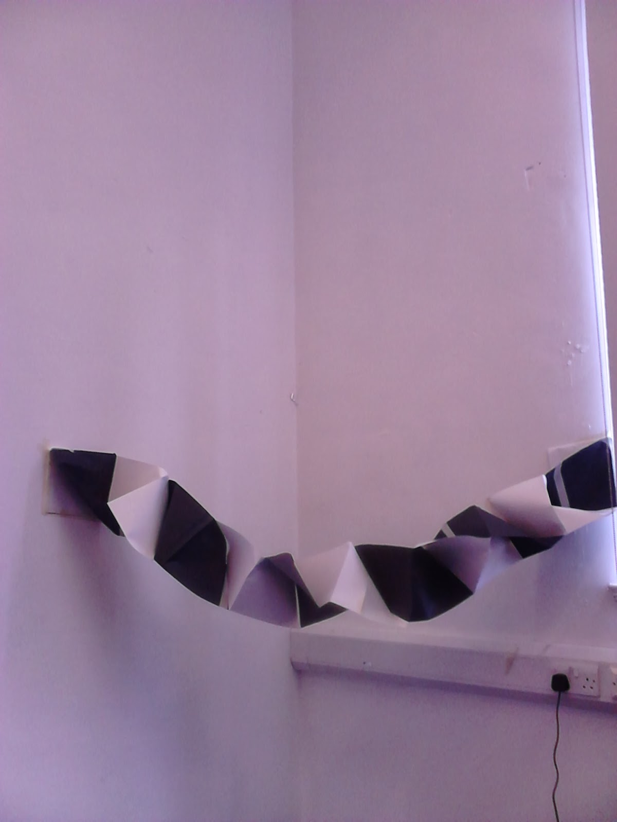
After choosing three words from a list, ours being 'fold', 'suspend' and 'light', we were asked to create sculptures using any of the materials found in the room. These are the results:


Then we proceeded to draw our sculptures, as well as those made by other students, using different methods such as continuous line drawn, and drawing only in straight lines.


Monday, 28 October 2013

Transforming the Everyday - Final Piece

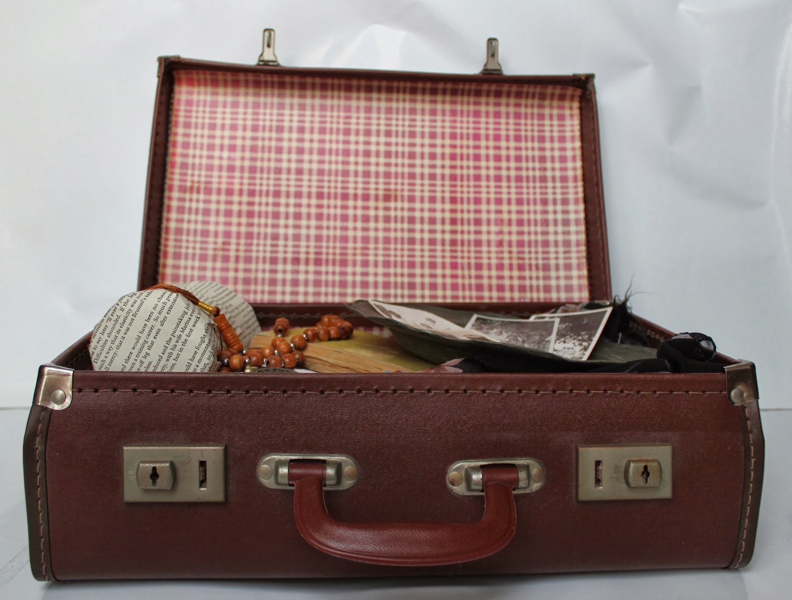
For my final project, I decided to use objects that were personal to me and I had a stronger connection to- my own magical objects. I chose to look at the story of my great grandmother, for whom I had great admiration as she, at a young age, crossed the borders of India to Pakistan during the 1947 partition. I was inspired not only by her bravery while going on this journey, the partition being the biggest migration of the 20th century during which thousands lost their lives, but also the strength it must have taken to leave behind her home and all she held dear to start a new life in a different place. Keeping in mind the stories that my great grandmother had told me countless times as a child, I decided to make a suitcase of my own, much like the ones from Willard Mental Asylum, documenting her journey from one country to the other, using the objects she brought with her to tell her story. Some of the objects I used were actually hers whilst others were those that I collected and imagined she would have brought with her. 

However, that didn't quite feel like enough. I wanted the objects to tell their story but I couldn't help but wonder if people who didn't know my great grandmother as I did would understand the story those objects were trying to tell. I wanted to physically bring those objects to life: If they could talk, what would they say? If we could follow their lives, where would they take us? To answer these questions, I decided to use my newly found interest in stop motion animation to create a short video following the life of one of the objects my great grandmother brought with her. The video, together with my suitcase, formed my final piece..

The animation follows the story of one of my great grandmother's possessions,
a steel glass, as it makes it way across borders with her. 


When presented, the suitcase was placed as seen above
Although unintentional, I like how the pages aren't quite covering the glass fully, the edges are lifted as if they are fraying. It gives the sense that the stories that it holds can't be contained as it is bursting with life. 

The glass, an actual possession of my great grandmother, has been covered in pages from the same
book as the one seen in the video to provide a stronger visual link between the suitcase and the video.
The spoons and plate are from my great grandmother's dowry, the pattern on which was said to be hand carved. I decided to put in the 'tasbih' (string of brown beads, the Islamic equivalent of rosary beads one might say) as religion was always a very important part of her life. 
These are some of the photographs I managed to collect from my relatives. My great grandparents can be seen in the first one, with my great grandmother in the middle in the second photograph. Adding the photos to the suitcase just makes the story more real and believable.


When presenting this piece, I played the video separately, with the suitcase placed on a table against the wall onto which the video was projected. I think the presentation could be more effective if the video was projected onto the opened suitcase, so that the story is in essence captured within the objects, physically and metaphorically. 

In Steven Connor's 'Parapharnalia', he says 'such things inhabit space, but are a kind of temporizing with it, a refracting of the white noon of now into a chronic rainbow of times, with their twilight tints and hues. Such things hum with hint and import because they are there without being fully present; to hand, but not exactly here-and-now.' This is the feeling I get when surrounded by these objects. They are haunting in a sense, but beautifully so. But it is I who feels like a ghost; as time passes, it is these objects that are still alive, long after the people to whom they belonged are not- they are unstopped clocks. 


Sunday, 27 October 2013

Magical Objects

In 'The Great Gatsby', Fitzgerald describes the objects that Gatsby associates some meaning with as 'enchanted objects', such as the green light with which he associates Daisy and the hope of being reunited with her. Once Gatsby is with her, the green light no longer holds the same significance; ''it was again a green light on a dock. His count of enchanted objects had diminished by one.'' These are the kinds of objects that I decided to look for; those that held meaning, had stories and thus became 'enchanted' because of our emotional investment in them..

Upon interviewing my neighbour, I found just what I was looking for. He had kept a collection of family relics and heirlooms; war medals, brocohes, wedding certificates, birth certificates etc, all kept locked and safe in an old, leather box.

The old, worn out leather adds to its feel of antiquity,
 proof of it's rich and eventful history..

I really like the frayed jute string that
holds the key and connects it to the box.  


 Each individual object found in the box had it's own life, a sense of being present but carrying with them an ancient weight, belonging an altogether different time..


Steven Connor, in his book 'Parapharnalia', describes objects like those above as 'magical objects'. He says 'We can do whatever we like to things, but magical things are things that we allow and expect to do things back to us. Magical things surpass themselves, in allowing us to increment and surpass ourselves with them.' Such is the nature of the objects I am interested in and wish to explore. However, for my project, I want to find objects that are 'magical' and 'enchanted' for me; something personal and meaningful. And I need not look very far...

Friday, 25 October 2013

The Lost Suitcases of Willard Asylum

The Willard Asylum of New York was an asylum for the chronically insane. Many of Willard's patients, once having entered it's wall, left only to be placed in it's graveyard filled with masses of, not named, but numbered graves. From within the old, abandoned building were discovered hundreds of suitcases of it's previous patients. Walter Benjamin describes possession as 'the most intimate relationship that one can have to objects' and that ultimately, 'it is he who lives in them'. The lost suitcases of Willard invoke this very sensation: the owners seem to be very much alive in their possessions.      

This now battered and deteriorating suitcase once belonged to a Delmar H. It was originally from a hotel in Bolgna,Italy.

   
Each suitcase contained fascinating objects, from everyday necessities to trinkets and ornaments and the owners most prized possessions. One patient, identified only as 'Anna', contained a list of all her glamorous objects...


It is most interesting to see the objects that they chose to bring with them, considering that they knew that the chances of them returning to their normal lives were slim. It makes one wonder what these possessions meant to their owners, what stories lie behind their decision to take them to their death bed, what deep connection they had to these inanimate objects and how they defined their personalities or even their illnesses..
Eleanor's sewing supplies.
This suitcase belonged to 'Dymtre'. It was said to have had 'notebooks filled with drawings of sine waves and mathematical things like that. There’s a wedding picture of Dmytre and his wife, and she’s holding a bouquet of fake flowers, which were also in the case.'Dmytre was said to have had gotten arrested by the Secret Service because he went to Washington, D.C. for saying that he was Margaret Truman’s husband.

   
Details of objects found in Dymtre's suitcase, including a red cross pin and a postcard.
Looking at these photographs, I am not filled with a sense of morbidity but rather an odd kind of nostalgia for a life I never lived. These objects are brimming with tales of their owners lives, each object unique. There is a strange comfort in looking at them, not simply because of their rarity or historical significance, but because they were part of someone's routine and by extension, them, therefore coming to life before us, revealing the lives of these long forgotten patients in profound and unexpected ways.

As Mrs Ramsay says in Virginia Woolf's 'To The Lighthouse': 'It was odd, she thought, how when one was alone, one leant to things, inanimate things; trees, streams, flowers; felt they expressed one; felt they become one; felt they knew one, felt they were one; felt an irrational tenderness thus...as for oneself.'